"Back Bay"
Aug 09, 2019
 Hello and Welcome Friends,
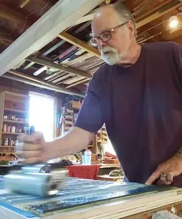
Although the high mountains have made my heart soar for many years, the meeting of land and water at the coasts stills my soul. I know I'm not alone in that response. Mood is something I strive for frequently in my printmaking. For me, that mostly takes form in color. I have a great advantage over many printmakers because I worked in watercolor and in oils for more than 35 years. I learned a great deal about color during countless hours at the easel.
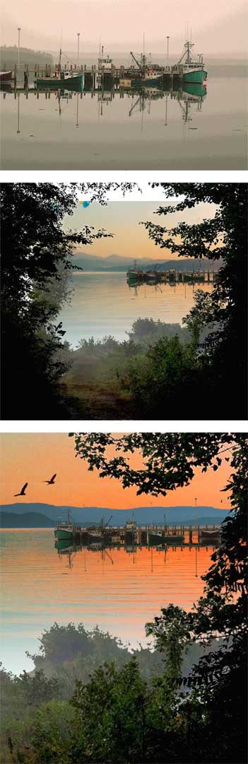
And so this next print is about color and mood. But first, the composition to carry the mood. I began with a photo I took years ago in Maine and started building a composition around this image. Here's the original image, a sketch/workup, and then the final composition.
As I frequently do, I began without any carving and laid down a solid block with three colors in a blend from left to right. Then I began to lay in the image on top of that foundation.
"Back Bay" impressions 1 & 2
Now the fun begins. For the third impression I used five colors applied with four different brayers. It is a slow process that gradually changes over the course of the three days it too me to do this impression for the full edition. Here's my palette, the block (inked and ready to print) and the third impression.
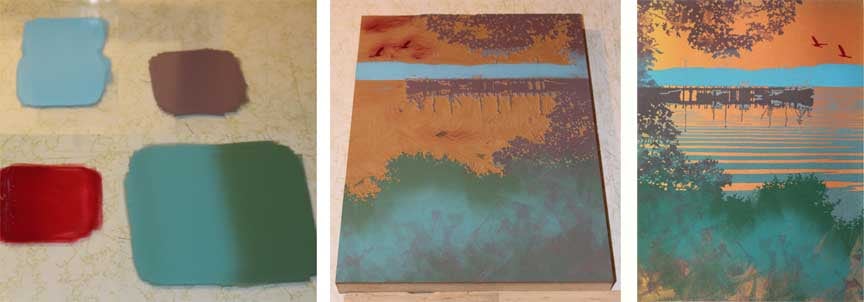
"Back Bay" third impression
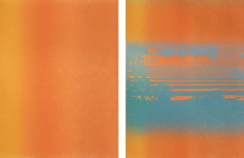
I wanted some degree of randomness and incomplete inking to lend individuality to each of the prints in the edition. In relief printing, laying down anything other than solid areas of color with the brayers is like painting with a baseball bat. There is some degree of transparency to the inks and so each layer of color is influenced by the previous colors. Here is impression number four followed by the block (inked) for the next impression and then the fifth impression.
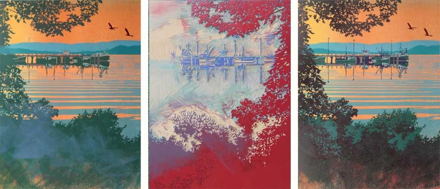
"Back Bay" impression 4 & 5
In the above illustration you can see that within the lower portion of the print I laid down greens and blues then followed that with a bright red. The result (right) is not so much red as varying shades of brown and violet. This is the kind of thing that experimentation and experience have taught me. In my early years of printmaking such combinations were more often a surprise than a plan. These days it is something I play with.
And here's the final print after three more impressions:
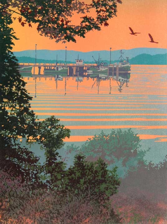
"Back Bay" 8-color linocut print, 12" x 9" by William H. Hays
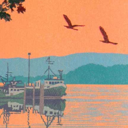
I was quite pleased with this print. One last thing - I want to show you a detail you can't really see in the above picture. I set out to have the two herons with just the tiniest outline of red on their leading edge. This was delicate carving and tricky to print but I really like they way it pulls them into the sky.
Needless to say, this project kept me busy for more than a month. But, after all, this is my work! I do hope you enjoyed seeing this process. You would be surprised how much of what I've shown you I have forgotten. Seeing the process again in stages is almost as new to me as it is to you. I find it very interesting and I hope that you do too.
You might like to see what other artists are doing with reduction printing. Mesh Art Gallery (which carries my work in Chicago) has produced a very good blog post about some of the best artists in the world using this process. I feel privileged to be included among them.
Feel free to write. I enjoy hearing from you!
Yours,
![]()
William H. Hays


