Hello Friends,
These two prints occupied the first three months of 2026. For each I'm going to share with you the process from the composition to the finished edition.
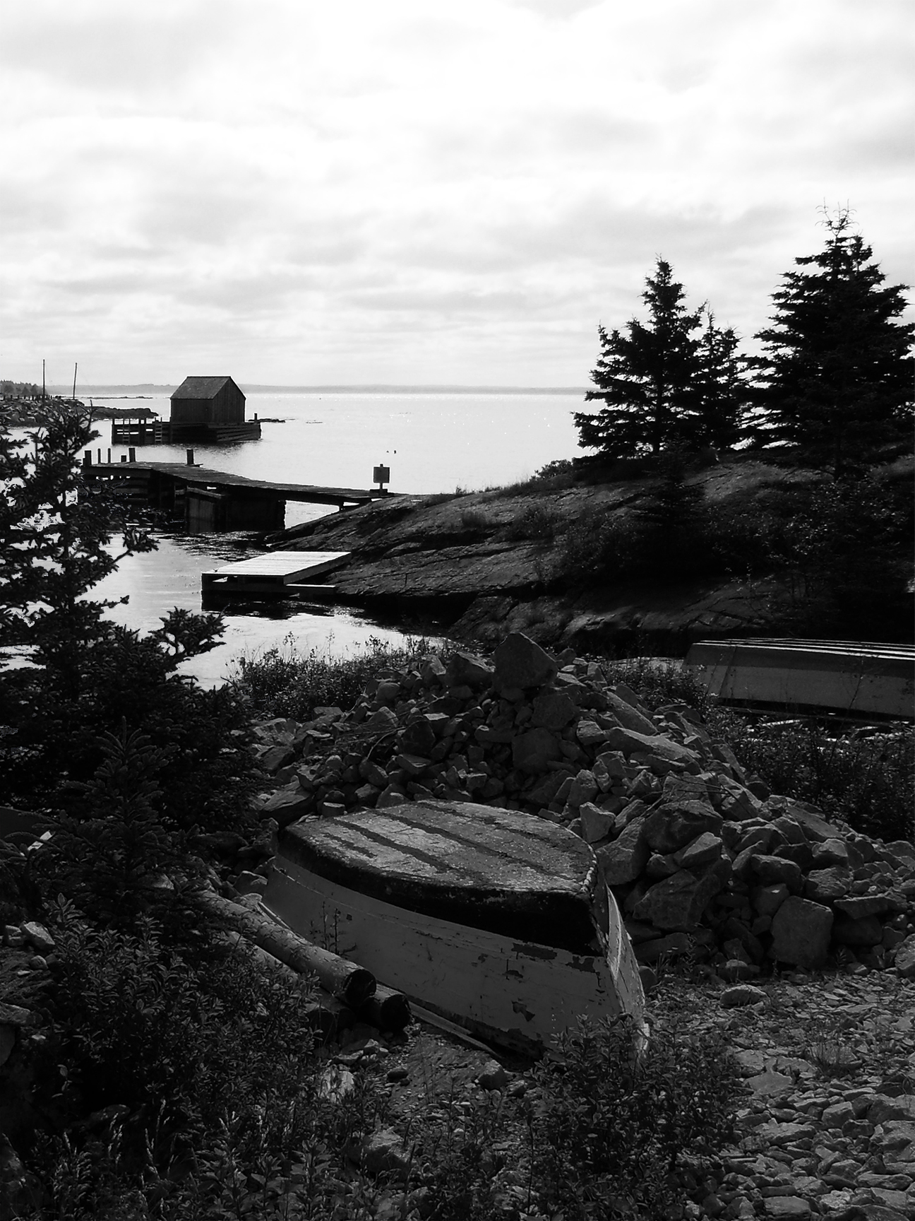
The first is inspired by the thirteen years my late wife, Patricia and I had the pleasure of enjoying the South Shore of Nova Scotia in the summer months. The beaches are pristine and thankfully uncrowded. The rocky coastline facing the Atlantic is very much like the coast of Maine, but the Maine of memory and nostalgia rather than crowded with cafés and gift shops. It's not that I mind those things, but the truly genuine and old fashioned qualities of the fishing villages in Nova Scotia are really lovely. One particularly picturesque place we visited many times is Blue Rocks. My composition is not a literal depiction of the place but rather a composite. This composition is black and white but originally this was two daytime color photographs I combined.
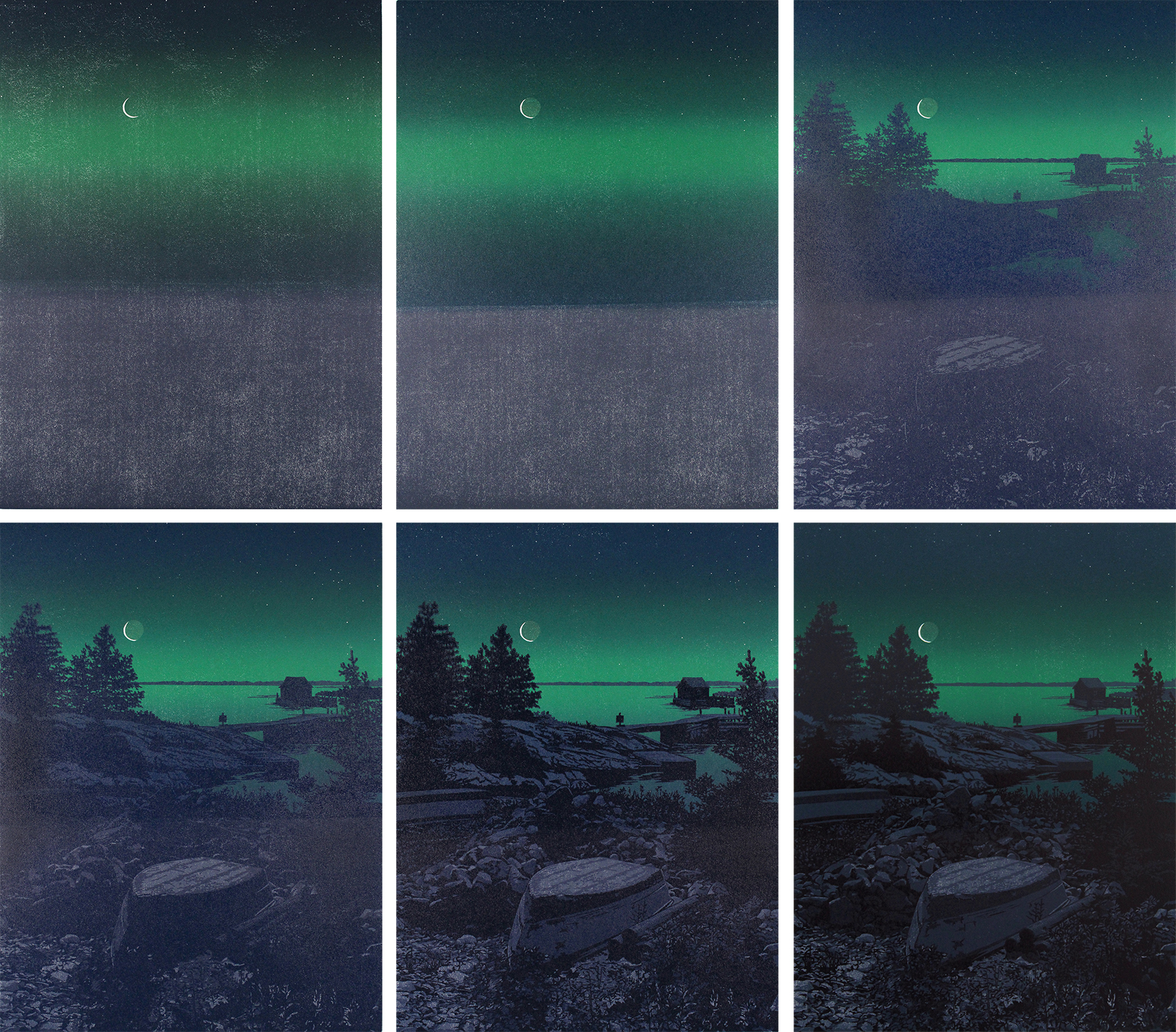
I was inspired to do another night scene by the print just before this one, "Starlight Shoreline" but with a different palette of color. The picture below shows how I applied color for the first impression - the ink palette on the left, the block with the tiny sliver of a moon (and nearly invisible stars) carved away in the sky. You can just barely see some of the drawing coming through the ink on the block. Keep in mind that these are going to be the lightest colors in the print. It is night, after all.
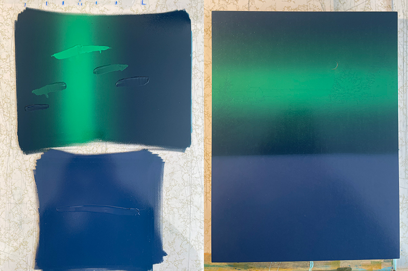
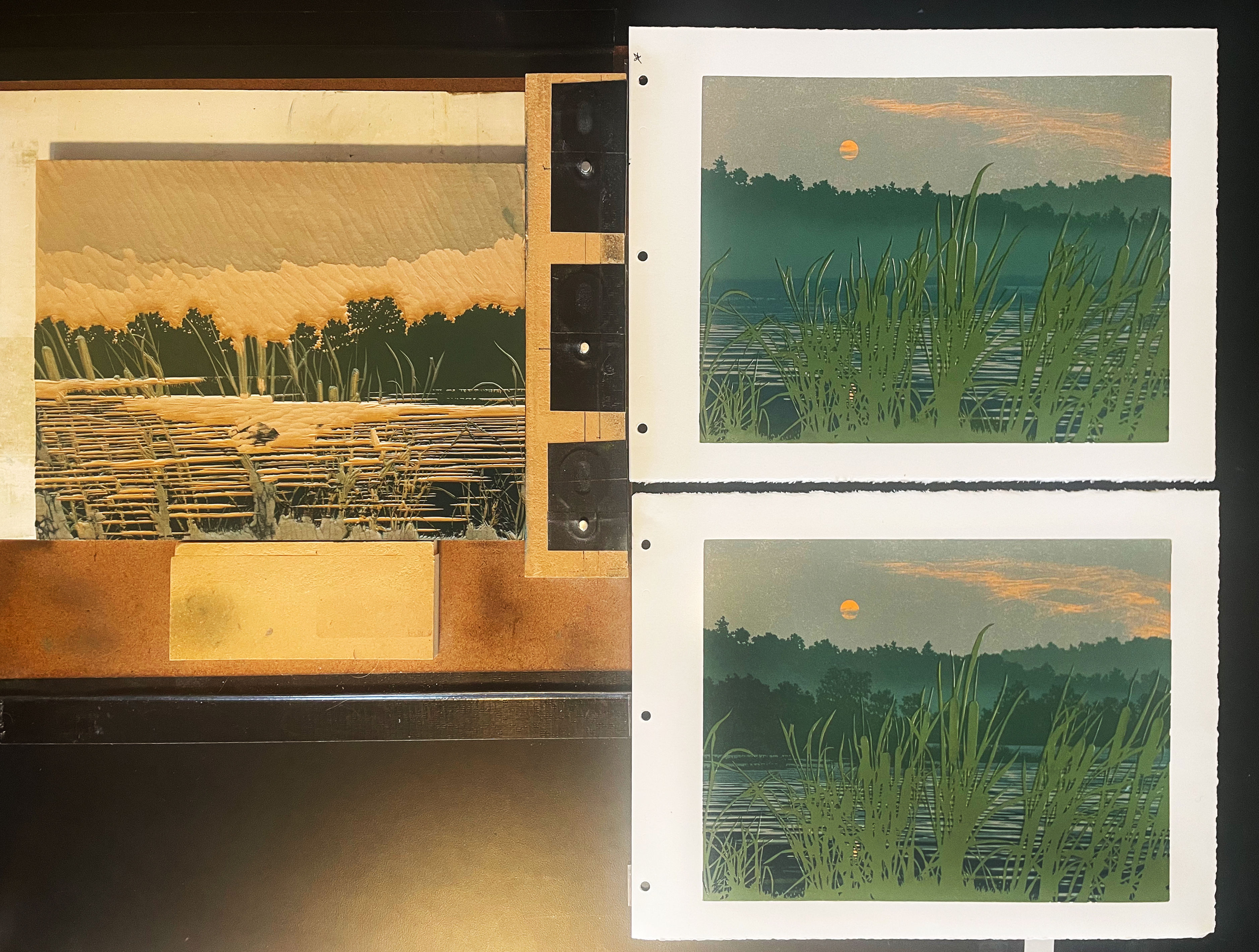
The three colors blended together for the sky were printed twice. The first time, as above. The second time I carved away the remainder of the moon to achieve the effect of earthshine on the moon. You can see below that the coverage of color in the first impression is a bit irregular. The second impression makes the sky nice and solid. Registration, or the alignment of each print on press exactly as before, is a challenge and takes quite a bit of care. The tiny stars are carved away and need to align nearly perfectly if they are to be seen at all. The finished print involved six impressions in total and here they are.
I was very pleased with the final print. I love exploring night scenes. Here is the final print. You can click on the image to see more detail.
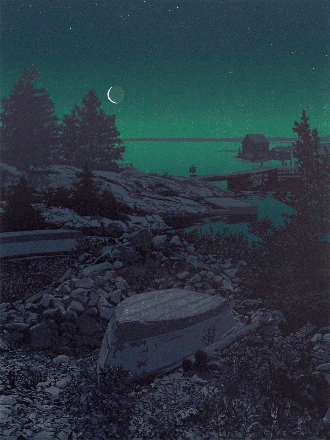
"The Fall Of Night", linocut print, 12" x 9" (31 x 23.5)
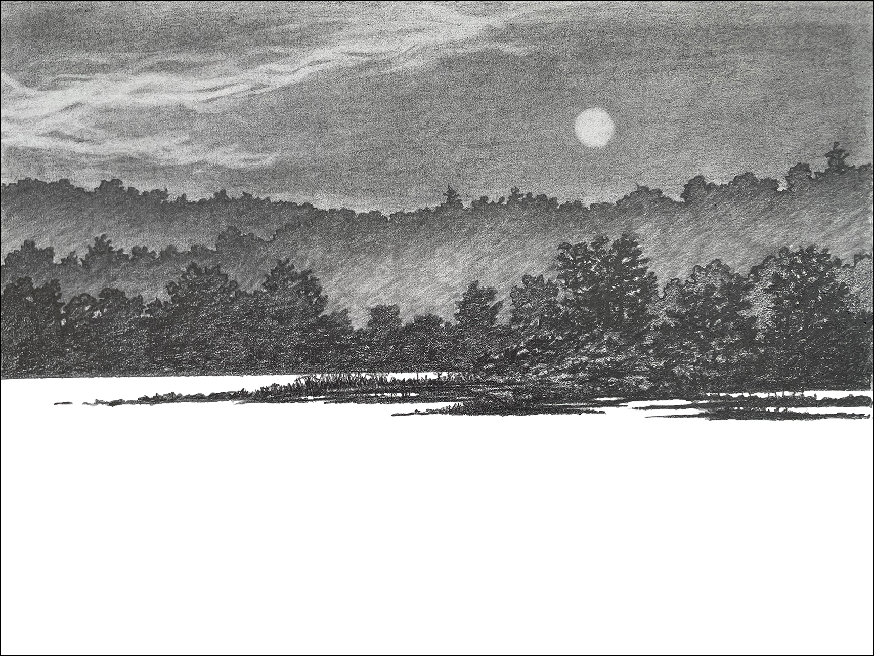
My next print took shape in my mind's eye while I was recovering from cataract surgery. I have many times explored the shoreline of the Connecticut River when I lived in Vermont and now living in Western Massachusetts. This past summer and the one before we had many days, and even weeks of wild fire smoke from Canada tinting the sky. The light of the days and sunsets had an unusual quality with the fine particles coloring the sun through the grayed skies, almost like the lead up to a solar eclipse. I started this print with a pencil drawing, not based on any place in particular. Here's that drawing.
From this drawing I later added the patterns of the water and the cattails in the foreground. I started with two blocks, one block for just the cattails and the other for everything else. It took more than a week to draw and carve the two blocks before printing anything. Here are the first four impressions showing how I applied the orange of the sun and then covered that orange almost completely. The wisps of clouds on the right (in the third impression below) are made by inking the block with the gray of the sky and then wiping part of it away with a towel. This is an inexact and slow process. The result is that each print is unique in the sky. The sun was a complete circle of orange when printed. I then brushed a little of the sky gray over the sun after printing, making each sun also just a little different from print to print in the edition.
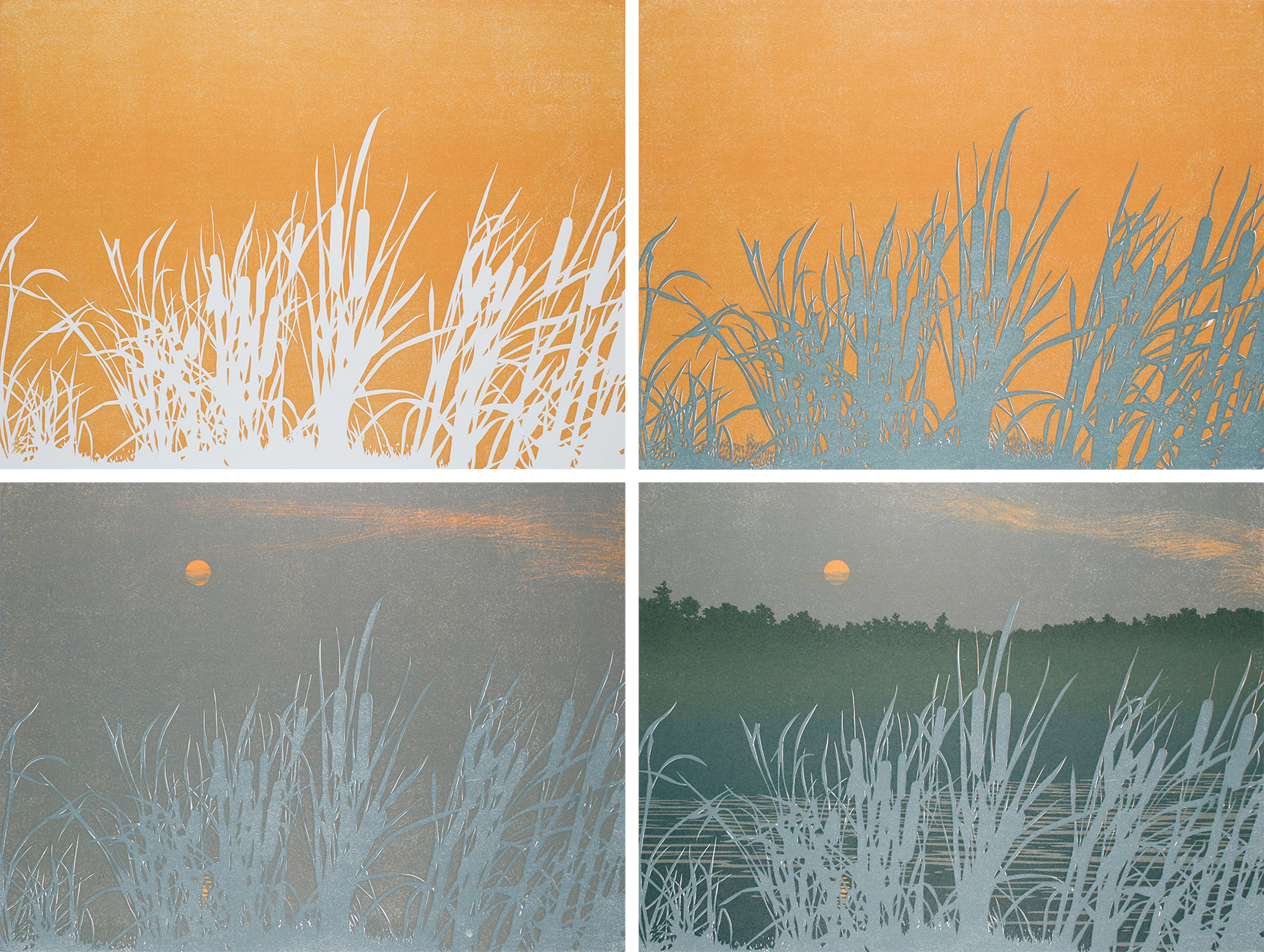
The very subdued colors (except for the sun) take great care to get the right balance. Sometimes I'll spend two hours mixing two colors. I'll do a test print and then rework a color. Another test print. Change it again. Each time I have to clean the brayers (rollers), the palette and the block I'm printing with. I am making decisions about colors without the benefit of seeing them accompanied by the colors which are yet to come. My color choices can be an act of faith sometimes - "I think this will work," I tell myself. I never really know until the last impression is applied.
The third impression, above, is just a single, solid color applied with two blocks and yet it took four days to complete for the edition of 100 prints. Below are a couple of images which might help you better envision what I'm doing. These show both the blocks and the prints in process.
In the first image, I printed both blocks (top) using the same color. That color looks very different when printed over the orange, making a warm gray rather than a blue. The cattails, printed with that same color have just the white paper underneath. The second image shows block used for printing for the seventh impression and the difference from impression six (top) to impression seven. You can also see that transition below.
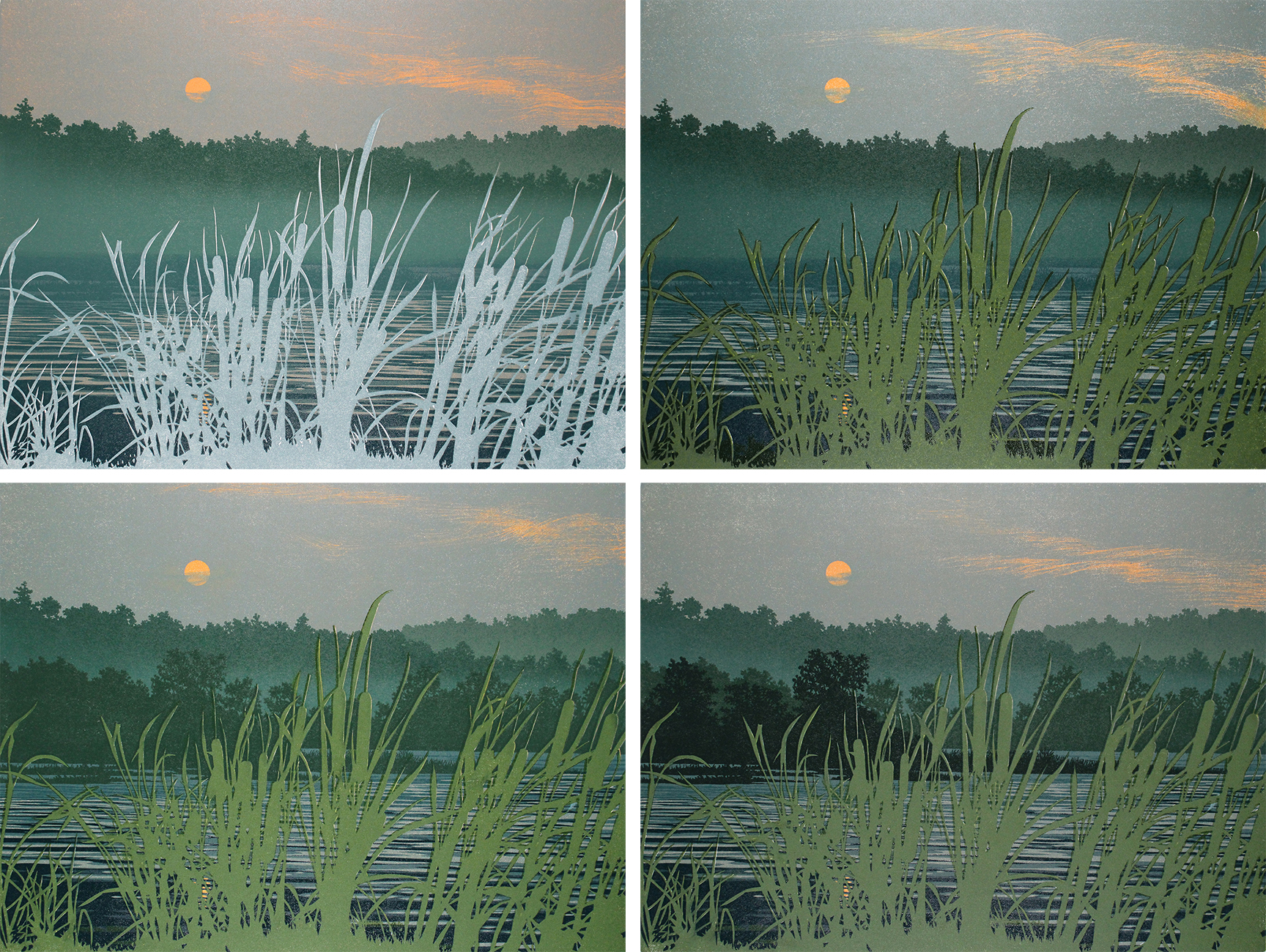
The four steps above show you a couple of different aspects of my color choices. Steps five, seven and eight are adding layers of the hills and trees in the background. These colors of green hover in the range of blue-green. The second impression above adds the first foreground green for the cattails. Although it is printed on top of the blue-gray of the sky, this is in the range of a warmer, yellower green. My purpose here is to make the cattails advance into the foreground with the bluer colors dropping back through atmosphere. Below is the finished print.
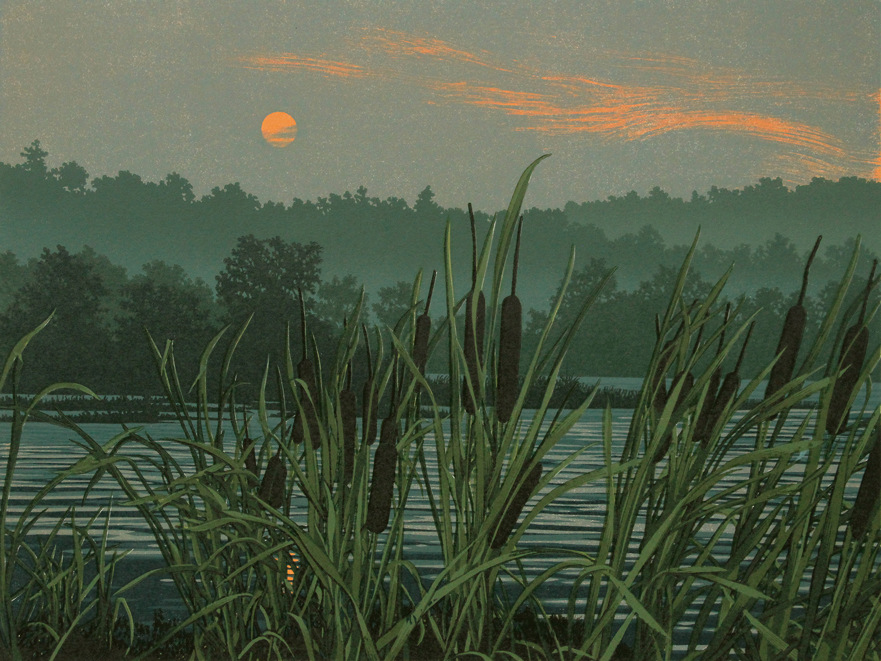
"Northern Fires, Sunset", linocut print, 9" x 12" (23.5 x 31)
And so, that covers the first three months of this year, 2026! My wife, Nina asked me what the next print is going to be. My response was, "Something lighter." As a painter in watercolors and oils, I have often characterized my color choices as being "with a heavy hand." Most color woodcuts and linocuts (especially the traditional Japanese prints) have a more pastel palette. That has much to do with using water-based pigments, like watercolor, applied with a brush onto the block. My techniques are not in that tradition. I use oil-based inks that are applied with a roller/brayer on the block. This gives me the opportunity to explore much more deeply saturated colors than the water-based printing. These two prints are a good example of that.
I always enjoy hearing from you. Let me know if you have questions I can answer for you. Thank you for reading about my work!