Dark Days In Winter
Feb 27, 2024
HELLO AND WELCOME FRIENDS,
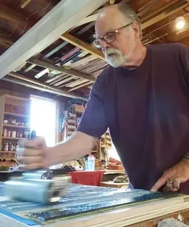
After ten years in Alaska and more than 30 in New England, winter figures prominently in my choice of subjects. I love the deep contrasts of the snow with rocks, trees and water. Snow takes on so many shades and colors. It is always the brightest part of any winter landscape but not necessarily the brightest part of my compositions. After all, the sky can still be bright while the snow is in shadow.
The first print I'll share with you is an example of just that, a snow covered landscape where the snow is not the brightest element in the composition. Along the Connecticut River there is very fertile farm land we enjoy in all the seasons. This frosty dusk leaves the last light of the day casting beautiful warm colors on the clouds above the shadowed landscape. Here are the first four impressions for this five-impression print. You'll see that I'm applying more than one color to the block for each impression.
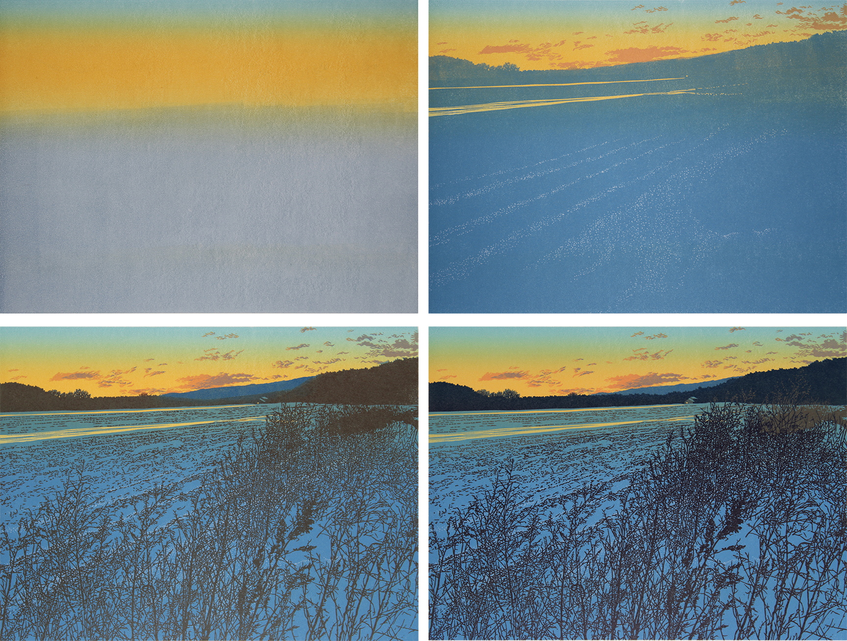
"Winter Field", impressions one through four.
The final set of colors snaps everything into its place in the receding space. My choice of colors was very particular in this print since I wanted it to have the elegance of that soft light at the end of the day. Here's the final print:
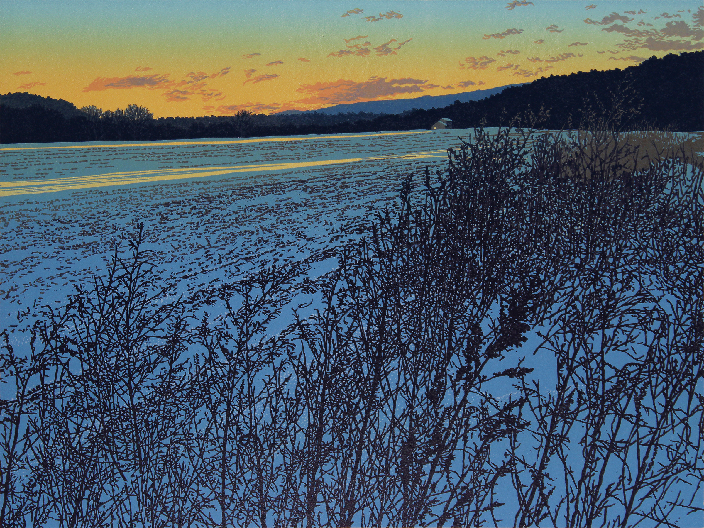
"Winter Field" linocut print, 9" x 12" (23.5 x 31)
Of course, it gets much darker than this in the winter time. So that's where I went next. Night.
But that's not how this print started. I began with a walk along the river with Nina where we saw a beautiful moon hanging in a wash of lovely pastel colors. Here's a snapshot I took:
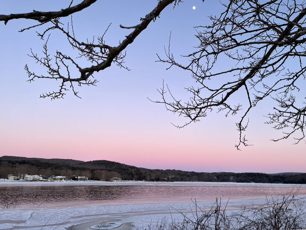
Now, those colors are beautiful and maybe someday I'll use that. But not for now. Still, I liked the idea of the branches of this mulberry tree reaching into the frame with the moon and the water. A couple of days later it snowed and I shot some more pictures of the branches. Then I reworked everything into the composition I wanted and started with a layer of the lightest color:
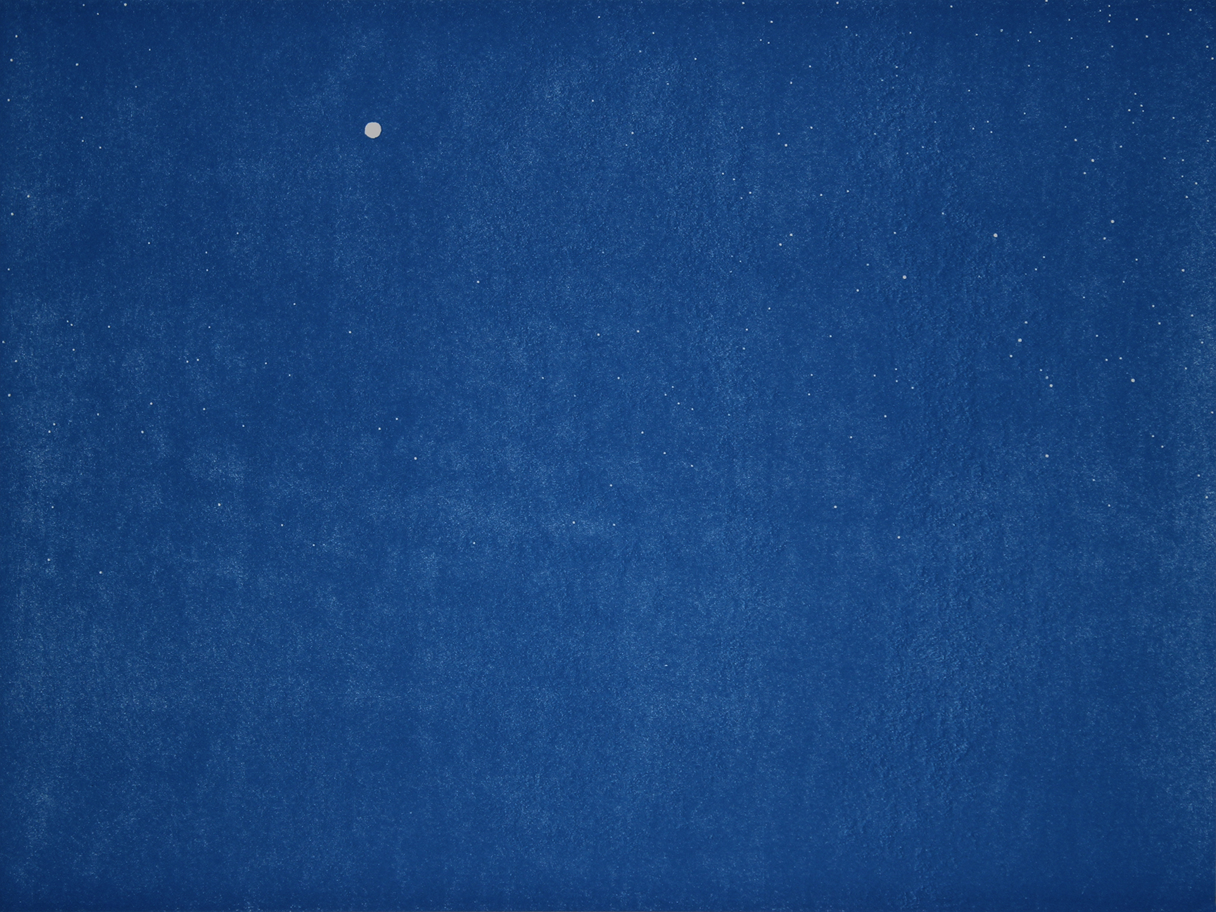
"Lapis Moon" first impression
I agree. That's not very light. But this is a nighttime print. Only the moon is bright - and the stars! Can you see the stars?
Those stars are a technical issue. In this first impression, they're perfect. But I have to put another layer on top of this one that is much darker and it has to line up perfectly in order to see the stars at all. Still, with much practice, I managed to succeed at this:
"Lapis Moon" second impression
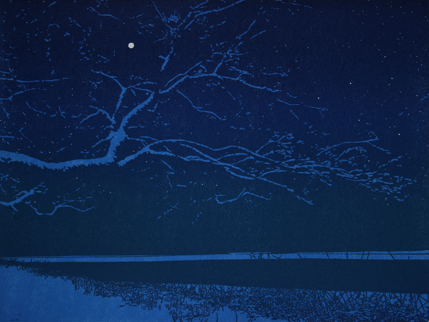
Now you can see how this composition is shaping up. Still, I needed to go darker, twice. And here is the final print:
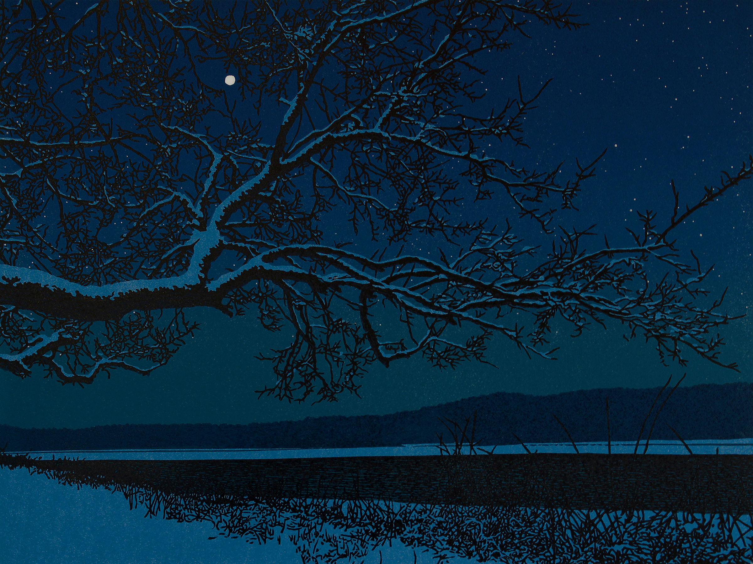
"Lapis Moon" linocut print, 9" x 12" (23.5 x 31)
And that's what I've been doing for the first two months of this year. Not all of it but a substantial portion. I'm always sending works out to galleries and to folks who buy from me directly (thanks for both!). As well, my prints are often featured in shows around the country. Lately I am included in an exhibition at the Copley Society of Art in Boston - to which I have recently become a member artist. It's good to show my work in Boston and the response has been very strong for my work.
I do hope you enjoyed seeing how these two linocut prints took shape. If you would like to see my work in person you can take a look in the galleries which carry my prints. I do my best to show the prints online as they are in person but seeing them in person is the way to go. This new print, "Lapis Moon" can be purchased from this website.
If you have questions or would just like to touch base, don't hesitate to write to me. I enjoy hearing from you.
Yours,
![]()
William H. Hays