Daybreak, Peggys Cove and Oil Paintings
Oct 01, 2012
 Hello and Welcome Friends,
I left you long ago (back in April) with one of my favorite prints yet, "Forest in Moonlight" and our trip to see Orozco's murals at Dartmouth College. I did not drop off the face of the earth after that and have some new work to share with you as a result. My prints continue to be well received and they are now being shown in two more galleries in Nova Scotia, the Flight of Fancy Gallery in Bear River and the Amber Rose Gallery in Mahone Bay... and for the past nine years, at the Art Sales and Rental Gallery at the Art Gallery of Nova Scotia in Halifax... and for the past twelve years at the ADJA Studio and Gallery in Liverpool.
I had wanted to continue my printmaking in Nova Scotia and had a lead on two different etching presses but neither owner was willing to let them go even though they were not being used. Partly for that reason, my enthusiasm for painting was not very high this summer. Nevertheless, I did do some editing and repainting of canvases. Let me share two of them with you.
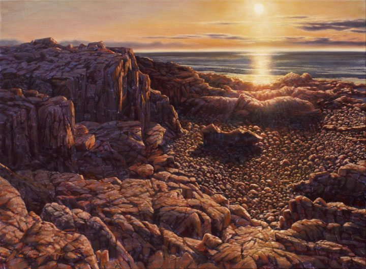
The Ovens, near Lunenburg, Nova Scotia is one of my favorite places. You know this if you've been following my work for a while. This next painting is based on the first watercolor I did at The Ovens back in 1998. I always liked the simple composition but decided to heavily glaze a violet over almost the entire painting to darken it, thereby making the sun brighter.
"Sunrise at The Ovens (2004)" Oil on Panel 16" x 23"
"Sunrise at The Ovens (2012)" Oil on Panel 16" x 23"
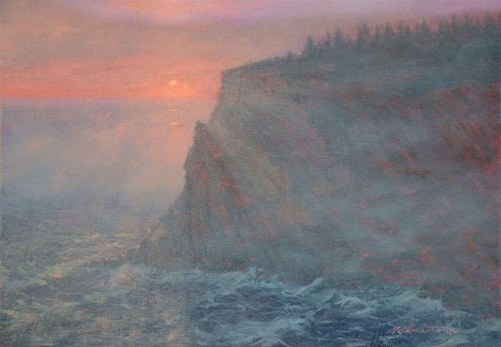
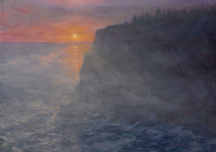
This second painting followed almost exactly the same process as far as the painting was concerned. I put two strongly colored glazes over almost all of the painting. But after some considerable deliberation and discussion with myself and others, I decided to edit this painting rather dramatically - as well as repainting it.
"Brier Island Sunset (2009)" Oil on Canvas 28" x 38"
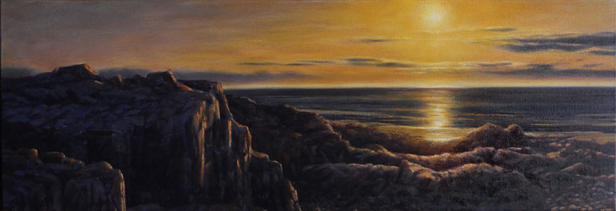
"Brier Island Sunset (2012)" Oil on Canvas 13" x 38"
When I returned to Vermont at the end of September I started right in on printmaking. I had been itching to do a second print of Peggys Cove. The first print of Peggys Cove was one of the first reduction linocut prints I did back in 2007.
Now, Peggys Cove is one of those places that, if you live in Nova Scotia, you've seen it a thousand times. It is fair to say that this lighthouse is the symbol and icon of Nova Scotia. It has been photographed, perhaps, millions of times and countless artists have tried their hand at it. This begs the question, "Why would you want to do a print of Peggys Cove lighthouse?"
To me, the answer is simple; Peggys Cove is famous for good reason. The setting is quite striking and the lighthouse is dramatically perched on granite barrens that surround it with an almost primordial atmosphere. Since it has been portrayed so many times (badly, most of the time), it has become a cliche. My challenge is to take the very reason it has become a cliche and transcend the familiar to remind the viewer of its extraordinary beauty.
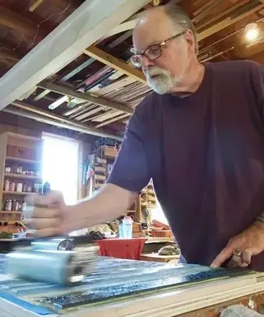
This print proved to be much more technically challenging than my 2007 effort. To begin with, I was using multiple blocks and printing opaque, translucent and transparent colors. To further stretch myself, I was printing not just in the usual progression of light colors to dark colors. I rearranged that order several times in the course of making this print. I'm going to share a few of the stages with you and will refer you to my Facebook photo album if you are interested in seeing a more complete progression of images from start to finish.
I began with a graduated tint of two colors in the sky and followed that with a lighter, warm gray over top of it (top). That was then followed by a darker blue gray over the warm gray.
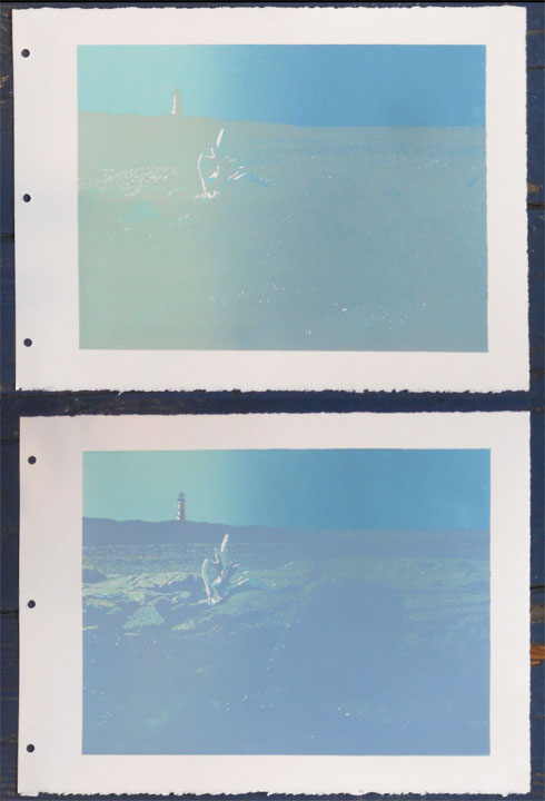
"Daybreak, Peggys Cove", second and third impressions
Below is the print at the seventh impression. By this time I have used three blocks. One block was carved only for a transparent blue laid onto just the water. The very dark color in the foreground is actually a red over top of a very dark blue. It is the final color used to define the granite as well. At least I thought so at the time. I changed my mind later.
"Daybreak, Peggys Cove", seventh impression
The image below has two colors added to the above. One is the green on top of the dark foreground red/violet. The other is a semi-opaque pink on the granite. I felt it was necessary to pull the foreground stone away from its surroundings - to make it stand out. There was a separate block, the fourth, carved for this color alone.
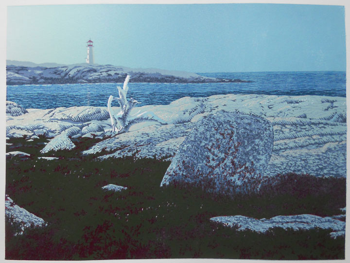
"Daybreak, Peggys Cove", ninth impression
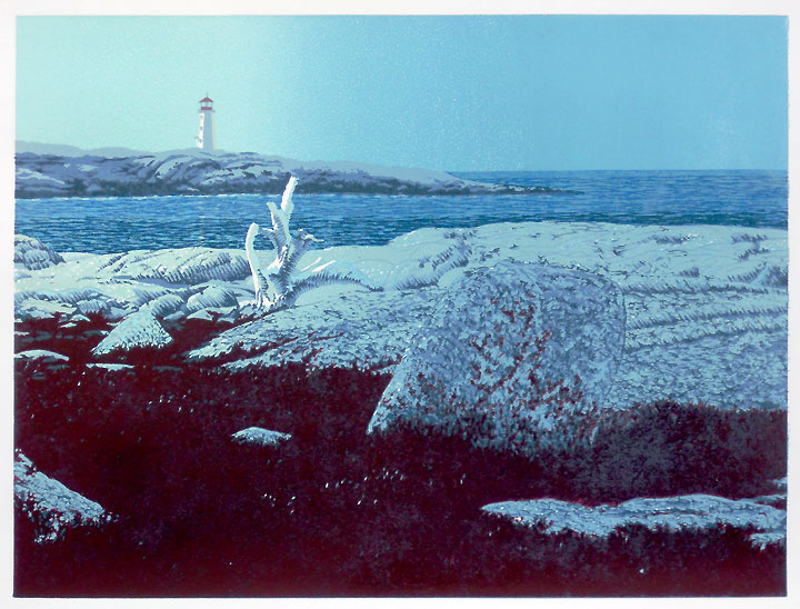
And finally (below), the finished print after twelve impressions and 14 colors. After the eleventh impression I thought I had finished the print. The next day Patricia and I were discussing possible titles while looking at the print. I said to her after about half an hour, "You know... I just can't get past a nagging feeling that I need to do one more color."
She said, "What color??"
"Red", I said.
"Go on, then...." She said.
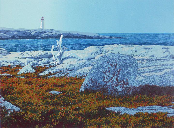
"Daybreak, Peggys Cove", twelve-color linoleum block print 9" x 12"
That's enough for the time being. Don't you think?
This Friday (November 2nd) is Gallery Walk in downtown Brattleboro from 5:30 to 8:30 PM. I hope you'll be able to drop by the studio [no longer open] on Gallery Walk night. But remember, we're open 10-6 daily in Brattleboro. I always enjoy showing my work to folks and often have a print underway so you can watch the process. Come on by!
Yours,
![]()
William H. Hays