My Favorite Place
Sep 05, 2026
Hello Friends,
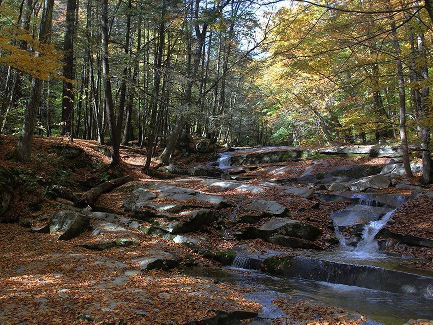
My last print was loosely based on what has proven to be my favorite place, Stickney Brook in Dummerston, Vermont. Since moving to Vermont in 1988 (I now live just a few miles south in Massachusetts), I have visited this place many times. On location I've done drawings, sketches, watercolors and one oil painting, and I've taken perhaps hundreds of photographs. After finishing the previous print, ("Emerald Stream") I woke up one morning and said to my wife, Nina, "I have to go to Stickney Brook this morning." And so I did.
Getting out of the car I was immediately struck by how very beautiful it is. Each time I do this it feels like I'm seeing this place for the first time. Therein lies my inspiration. I'm just fascinated by the thin layer of water flowing over massive slabs of granite that are nearly level, cascading in an irregular staircase descending to the West River.
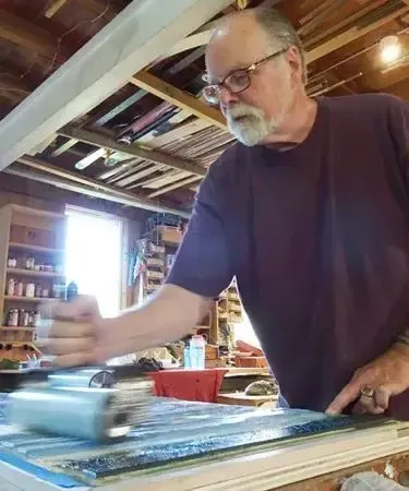
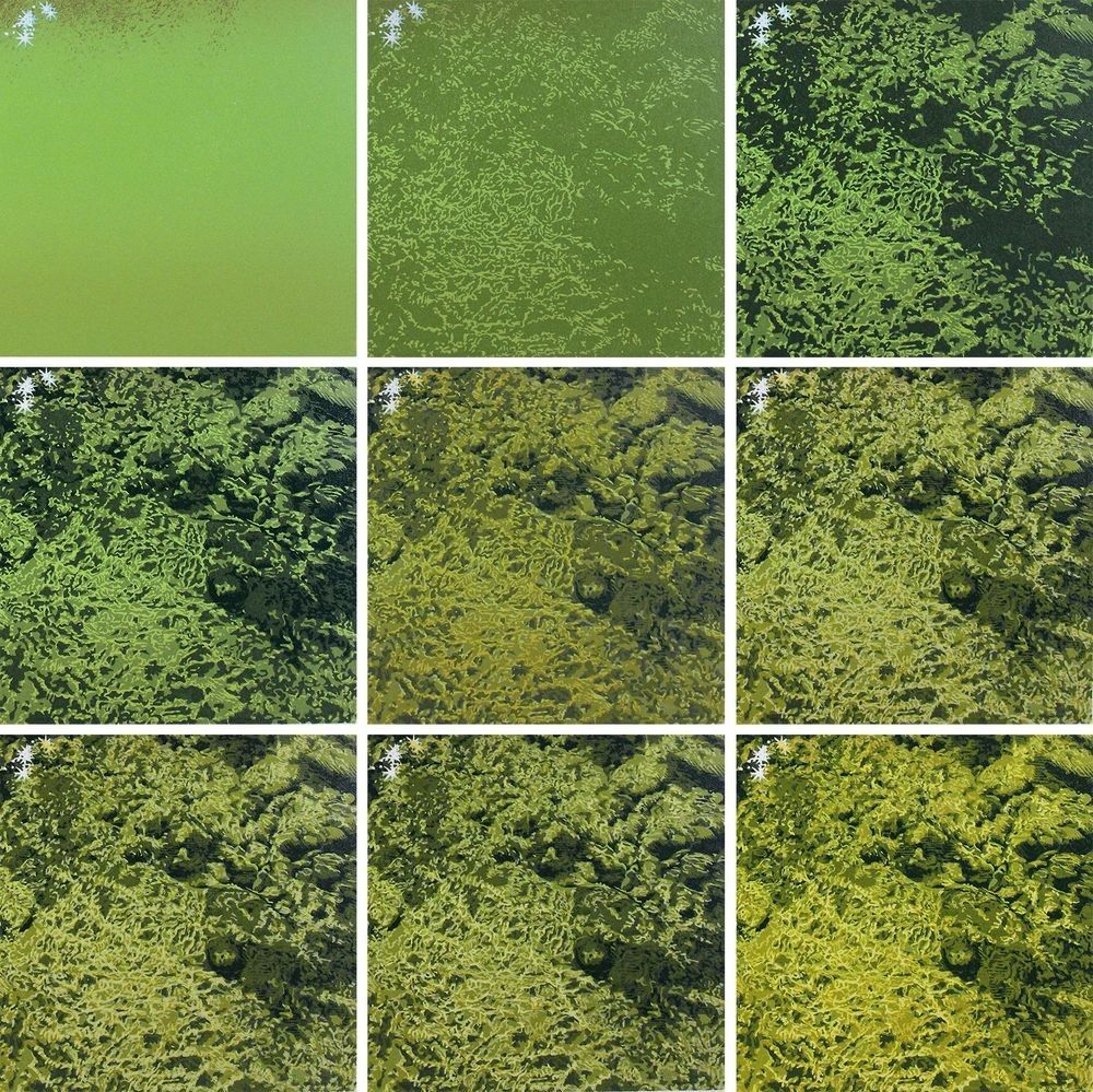
When I look at the water I see patterns in constant motion. Since my medium of linocut printing is definitely not in motion I pick apart the patterns and find rhythms in them. Carving these patterns into the block I try to suggest what I have seen. In the composition for my print I used the crest of one of the falls as my horizon line, very close to the top on the composition. I began by laying down blues that will remain open as reflections on the top of the water. Then two layers that define the color of the water. This then influences each of the following layers of color. In the second impression I added a rusty red with my finger and a wash cloth. Here is the progression of the first six impressions of ten.
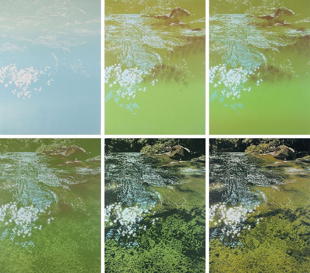
In the fourth impression above you can see that I'm beginning to carve the patterns which I hope will suggest the water and light flowing over stone. In the sixth impression I've put down a layer of transparent yellow with a little bit of red.
In the following four impressions I've done something which I normally avoid, laying down opaque inks to lighten the image. The most opaque white I have is not truly opaque. So I experiment a lot with mixing colors before making a decision and proceeding. Here of the four final impressions.
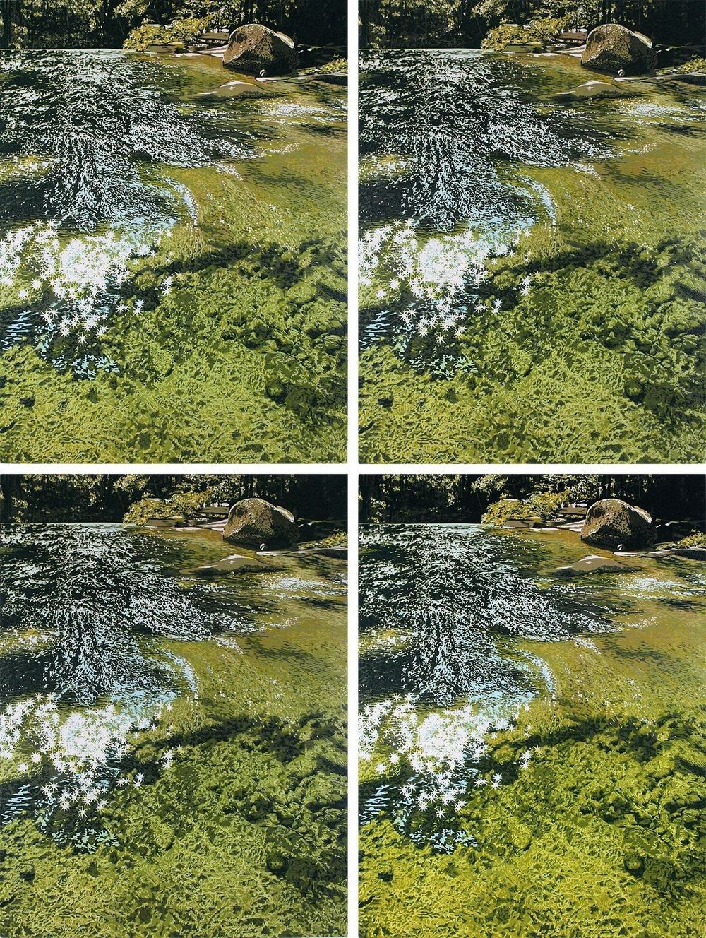
I imagine that you can see the increasing complexity of my exploration of patterns in the lower half of the print. In total I used three blocks. The first two blocks were carved and printed multiple times. The final impression was to lay a transparent yellow over the lower half and that block was carved exclusively for that final layer. Here's the finished print, "Above The Falls."
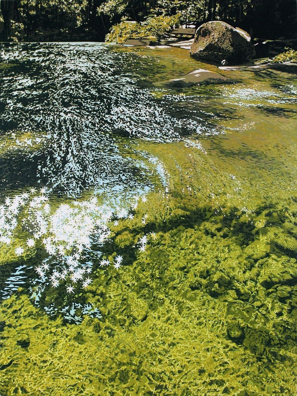
"Above The Falls", linocut print, 12" x 9" (31 x 23.5)
Let me illustrate for you what I talked about regarding patterns. I put together this sequence of the lower right quadrant to provide more detail in the sequence of colors. The last image shows you more of what I see when I'm working - patterns and layers of color.
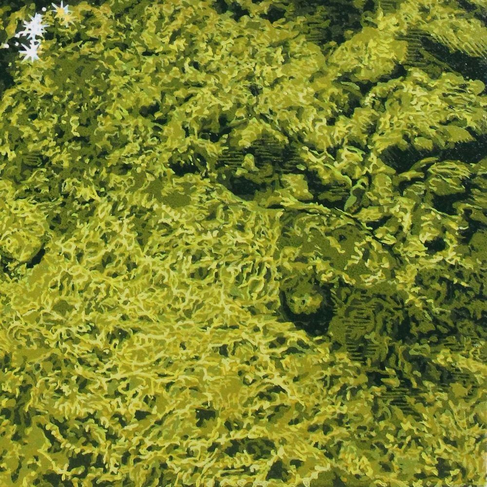
I'm pretty pleased with "Above The Falls" but that does not mean I'm finished with this place and its endless display of quiet beauty.
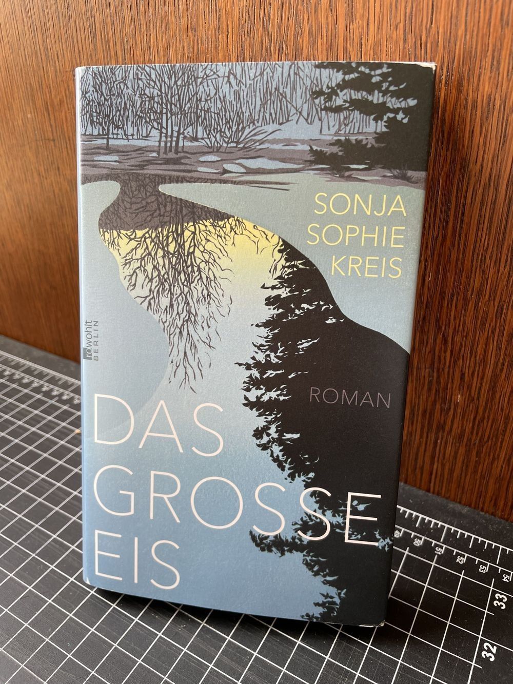
I've got some good shows coming up with my print, "Crystalline Light" featured in the Boston Printmakers Biennial Show (9/2 - 11/21/2026), juried by Esther Adler from the Museum of Modern Art in New York. This print is one of 93 in the exhibit and was selected from among more than 2000 international entries. In Houston, Texas three of my prints will be included in a curated show ThinkINK at the Silos Gallery 200 from 9/26 through 11/1/2026. Lastly, I was so pleased to receive a copy of Sonja Sophie Kries's novel, "Das grosse Eis." The cover image is using my print, "Ice Dawn" and I think it looks very good!
You can purchase "Above The Falls" from me on this website. To see my work in person take a look at the galleries which represent me and enjoy your visit. Each of them is a wonderful destination. Thank you so much for your interest and continued support of my work. I always look forward to hearing from you and I wish you all the best in your life.