Waters Edge and Autumn Field
Aug 01, 2017
 Hello and Welcome Friends,
I can't believe it's been five months since my last newsletter! I have two new linocut prints to share with you and much news. I'm going to start with some of the news and will end with more news after the prints.
In July I was contacted by the Curator of Prints and Photographs at The Boston Athenaeum to ask if I would show them a portfolio of my work for possible acquisition for their permanent collection. Of course I was happy to do that. Curator Catharina Slautterback warmly welcomed me to the Athenaeum on Boston Common. Founded in 1807, the Boston Athenaeum is one of the oldest and most distinguished independent libraries and cultural institutions in the United States. It's a literal treasure house of American and New England history. You can read a little more about this in this press release.
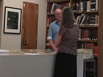
Boston Athenaeum Curator, Catharina Slautterback and William discuss his portfolio of prints.
I've had a good year with awards from various galleries and organizations. The latest was recieving the Best In Printmaking Award from the League of New Hampshire Craftsmen 84th annual fair. The quality of the work in this exhibit is very fine and I was once more honored to receive this recognition.
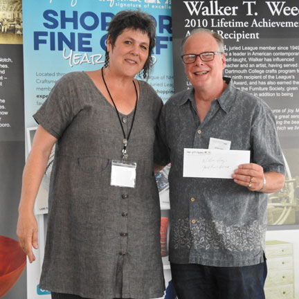
League of New Hampshire Craftsmen Executive Director, Miriam Carter presents the annual Printmaking award to William Hays.
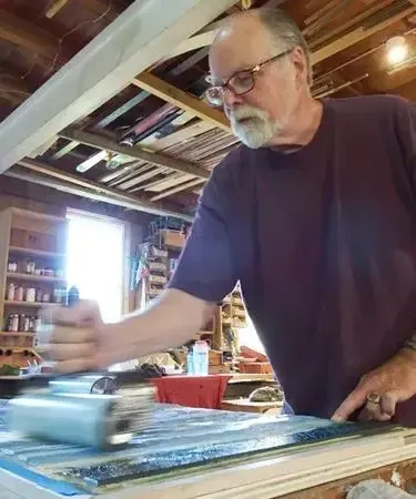
Now on to my latest in the studio. Both of the following prints are based on oil paintings I did years ago. Given the number of years I painted, I have a pretty good selection of compositions to select from for my linocut interpretations. The imagery of the following print, "Waters Edge" is from the meeting of the Connecticut River and the West River near my home in Brattleboro.
This print builds on many work I've done over the years in watercolor, oils and in linocut prints. The latter, more recently coming off of my little print, "Sultry Evening." The completed print is the product of eleven impressions on press but I won't examine them all in detail - BORING! It's like watching ink dry!
Below are the first eight impressions.
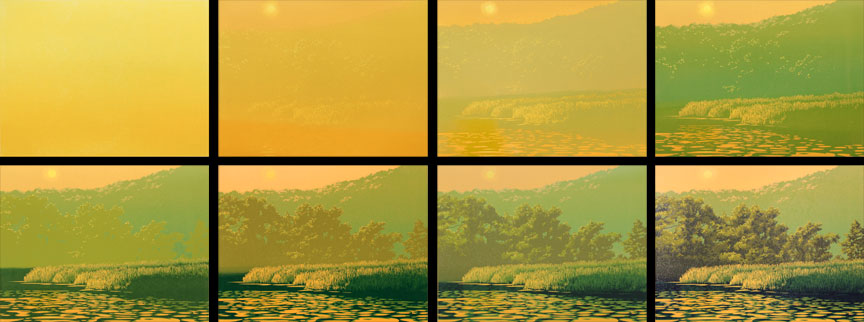
"Waters Edge" impressions one through eight
It's a bit difficult to convey the shifts in color balance that result from the layering of inks. But you can generally see how the image develops in the above sequence. From here I added a couple subtle colors and then a rather significant impression in the midground of the blue and here's the final result.
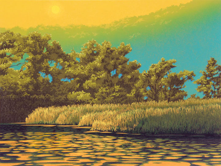
"Waters Edge" 11-color linocut print, 9" x 12"
This next print "Autumn Field" is also an interpretation of an oil painting of the same name. The painting took form over the course of nearly a year, off and on. The print took nearly two months of steady work. I'll show you the development of this print the same way as the previous print, with the first eight impressions then the finished print. But first I want to show you how I started.
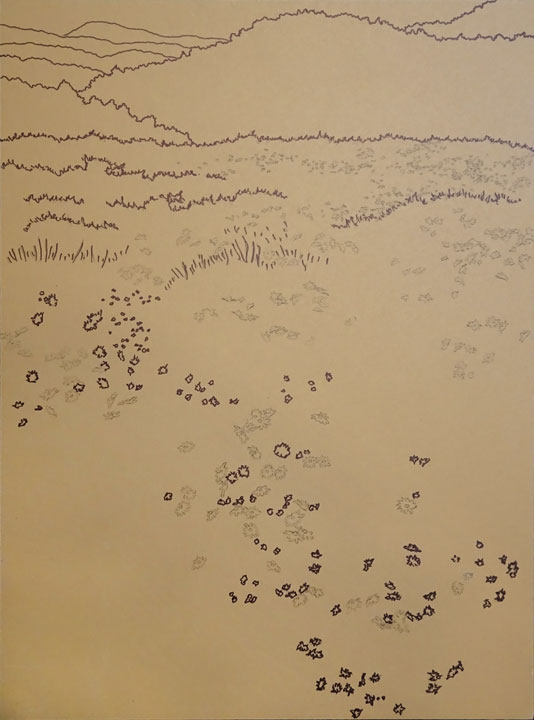
I knew that since three quarters of the linoleum block was a field of grass, drawing a thousand blades of grass would be ridiculous. In my years of experience, I've come to understand that I need to think in terms of pattern (carving blades of grass with a V-gouge) and rhythm (the distribution and size of these blades of grass). So below is the linoleum block before any carving took place. The drawing is transferred to the block with carbon paper and then over drawn with a fine Sharpie for lines which will last through repeated inking, printing and cleaning. The carbon paper lines (gray lines) are only for those areas carved away to reveal the white of the paper (daisies) before printing the first color.
For the first seven impressions I was essentially doing two different prints, one of the mountains and one of the field of grasses and flowers. Each area was built from light to dark colors. Then, in the eighth impression you might notice a slight color shift in the field when I added the lavender colored flowers and used a separate little block to stamp a burnt orange set of flowers within the lower part of the grasses.
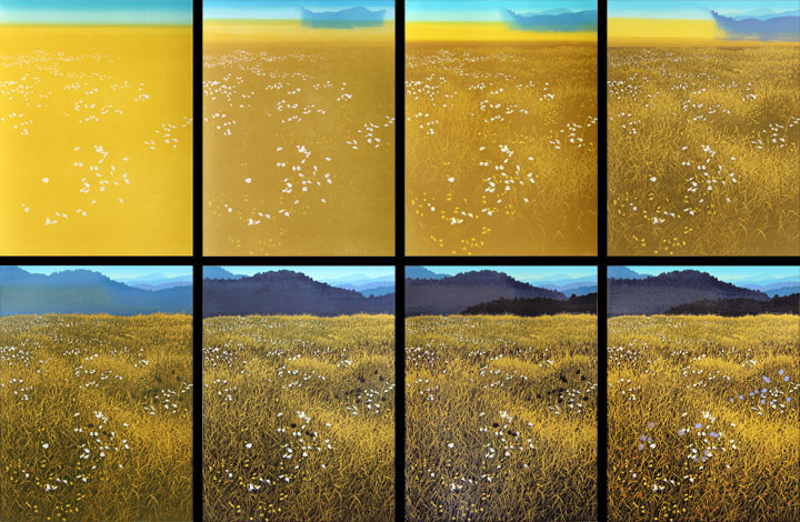
"Autumn Field" impressions one through eight
In the final impressions I added a layer of transparent blue over the near mountains along with another separate block stamping of the same blue within the light areas of the grasses. In all I used four separate blocks to print ten impressions. I'm very pleased with the way this came out. I always liked the oil painting, but I think I like the linocut print better.
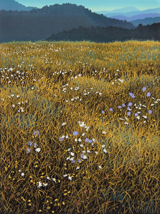
"Autumn Field" 10-color linocut print, 12" x 9"
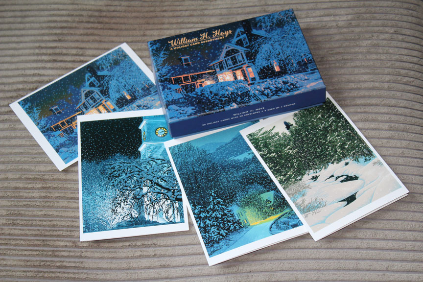
Finally, here is something I'm very excited about. Pomegranate Press out of Portland, Oregon has published a boxed set of 20 holiday cards with four of my prints featured. They are lovely and I'm certainly going to be sending them out to folks in a few months. If you'd like to purchase a box or two they are available from Pomegranate directly online. They will be in stores, galleries and museums nationwide (US) also.
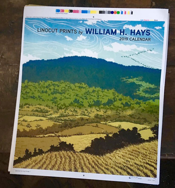
Pomegranate Press is also preparing to publish a 2019 wall calendar of my linocut prints, appropriately titled "Linocut Prints by William H. Hays." I've just recieved the proofs and am quite pleased and impressed with the quality of this company's work. It will also be available nationwide (US) beginning the middle of 2018. I do look forward to that!
As you can see, it has been a very busy five months since my last newsletter. I hope you enjoyed seeing these two new prints and reading about my other projects. These new prints can be purchased from this website (not matted or framed) if you'd like to add them to your collection and your home.
Do write. I enjoy hearing from you.
Yours,
![]()
William H. Hays